Example: Analyzing pattern sequences
In this example we will demonstrate further possibilities of examining sequences of patterns obtained from converging Hopfield dynamics on some windowed raw multi-neuron spiking data. This allows us to discover salient underlying dynamical structure in such data.
We again work with a synthetic data set, as in the basic example.
Creating a synthetic data set
Let us first create our synthetic data:
import numpy as np
from hdnet.spikes import Spikes
from hdnet.spikes_model import SpikeModel, BernoulliHomogeneous, DichotomizedGaussian

# Let's first make up some simuilated spikes: 100 trials
spikes = (np.random.random((50, 10, 200)) < .05).astype(int)
spikes[:, [1, 2, 5], 8 - 1::10] = 1  # insert correlations
spikes[:, [1, 4, 6], 9 - 1::20] = 1  # insert correlations
spikes[:, [2, 3, 6], 10 - 1::20] = 1  # insert correlations
spikes = Spikes(spikes=spikes)

Figure 2. One trial of synthetic data.
Fitting a Hopfield network
Again, we fit a Hopfield network to windowed spike trains (window length 1) and collect the memories over the raw data:
# the basic modeler trains a Hopfield network using MPF on the raw spikes
spikes_model = SpikeModel(spikes=spikes)
spikes_model.fit()  # note: this fits a single network to all trials
spikes_model.chomp()
converged_spikes = Spikes(spikes=spikes_model.hopfield_spikes)
Examining the pattern sequence
Let us now examine the memory sequence of the converged patterns. First we instantiate a SequenceAnalyzer object on the pattern instance:
from hdnet.stats import SequenceAnalyzer
from hdnet.visualization import combine_windows, plot_graph

patterns = spikes_model.hopfield_patterns
sa = SequenceAnalyzer(patterns)
We can now compute label probabilities, their Markov transition probabilities and Markov entropies of the labels (defined as the entropy of the Markov transition probabilities for each label):
# compute probabilities of labels, markov transition probabilities and
label_probabilities = sa.compute_label_probabilities()
markov_probabilities = sa.compute_label_markov_probabilities()
label_entropy = sa.compute_label_markov_entropies()
n_labels = len(label_probabilities)
Let us now plot some of the quantities that we calcualted:
# plot label probabilities, markov transition probabilities and node entropy
fig, ax = plt.subplots()
ax.hist(label_probabilities, weights=[1. / n_labels] * n_labels,
    range=(label_probabilities.min(), label_probabilities.max()),
    bins=50, color='k')

ax.set_xlabel('probability')
ax.set_ylabel('fraction')
ax.set_yscale('log', nonposy='clip')
ax.set_xscale('log', nonposx='clip')
plt.tight_layout()
plt.savefig('label_probabilities.png')
plt.close()
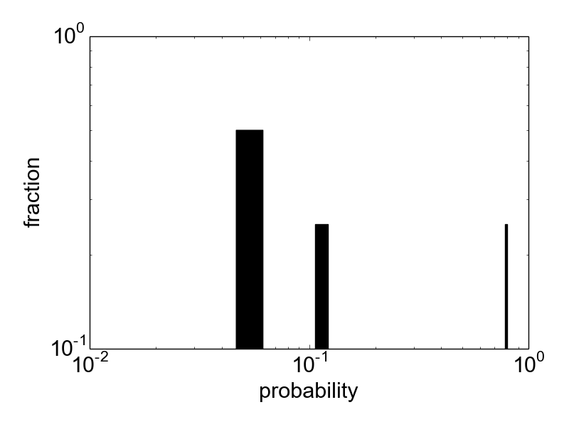
Figure 1. Histogram of label probabilities on a log-log scale.
fig = plt.figure(figsize=(8,6))
ax = fig.add_subplot(1,1,1)
cmap = mpl.cm.autumn
cmap.set_bad('k')
mp_masked = np.ma.masked_where(markov_probabilities < 0.001 , markov_probabilities)
im = ax.matshow(mp_masked, cmap=cmap,
            norm=mpl.colors.LogNorm(vmin=0.001, vmax=1))

ax.set_xlabel('to pattern')
ax.set_ylabel('from pattern')
ax.xaxis.set_ticks([0, 3])
ax.yaxis.set_ticks([0, 3])
plt.colorbar(im)
plt.savefig('label_probabilities_markov.png')
plt.tight_layout()
plt.close()

Figure 2. Matrix of Markov transition probabilities between labels.
fig, ax = plt.subplots()
plt.hist(label_entropy,
         weights=[1. / n_labels] * n_labels, bins=50, color='k')
plt.xlabel('entropy')
plt.ylabel('fraction')
plt.yscale('log', nonposy='clip')
plt.tight_layout()
plt.savefig('label_entropy.png')
plt.close()
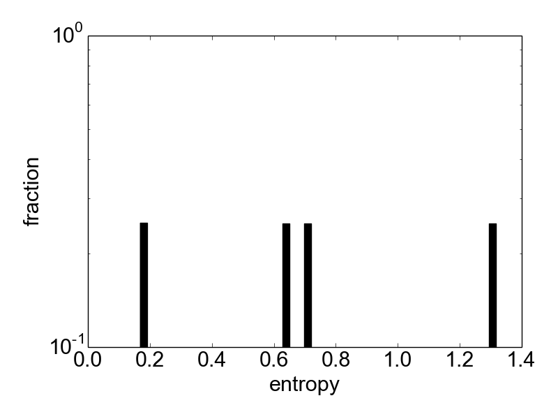
Figure 3. Histogram of label entropies.
Constructing the Markov graph
The matrix of Markov transition probabilities defines a graph, the so called Markov graph. Let us construct and plot it using a force based layout for the nodes:
# construct markov graph
markov_graph = sa.compute_markov_graph()
print "Markov graph has %d nodes, %d edges" % (len(markov_graph.nodes()),
                                           len(markov_graph.edges()))

# plot markov graph
plot_graph(markov_graph, label_probabilities, cmap1='cool', cmap2='autumn')
plt.savefig('markov_graph.png')
Figure 4. Markov graph drawn with a force-based layout. The base state is 0.
Furthermore, we can plot the memory triggered averages for all the nodes of the graph (where each node corresponds to a Hopfield memory):
# plot memory triggered averages for all nodes of markov graph
fig, ax = plt.subplots(1, 4)
for i, node in enumerate(markov_graph.nodes()):
    ax = plt.subplot(1, 4, i + 1)
    ax.matshow(patterns.pattern_to_mta_matrix(node).reshape(10, 1),
                vmin=0, vmax=1, cmap='gray')
    ax.get_xaxis().set_visible(False)
    ax.get_yaxis().set_visible(False)

plt.savefig('mtas.png')
plt.close()
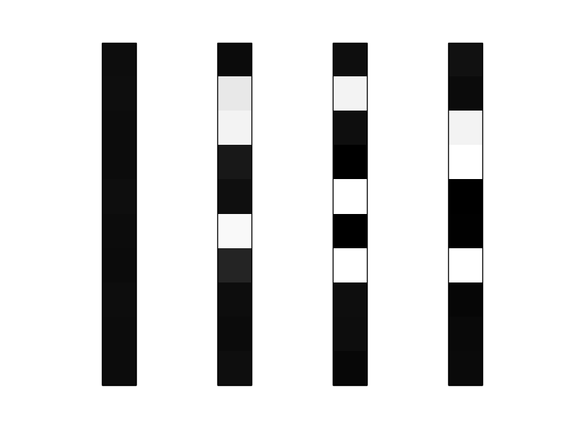
Figure 5. Memory triggered averages of the nodes 0, 1, 2 and 3 (from left to right)
Indentifying base states
In many cases we will be able to identify one node in the graph that corresponds to the base state of the network; characteristic for a base state is that it has high degree (sum of in- and out-degrees) in the Markov graph:
# try to guess base node (resting state memory) as node with highest
# degree (converging and diverging connections)
# -- adjust post hoc if necessary!
markov_degrees = markov_graph.degree()
base_node = max(markov_degrees, key=markov_degrees.get)
print "base node is %d" % base_node
As you will see, the base node is 0 in this case.
Cycles as reliably produced network reponses
Now we calculate simple cycles (i.e. closed simple paths starting and ending at the same node) in the Markov graph starting at the base node. Each cycle can be thought of as a cycle in the state space of the network, corresponding to an excitation cycle of the network and describing how it is brought out of the base state, passing through a series of transient excited states to finally fall back into the base state. This essentially corresponds extracting several 1-dimensional aspects of the network dynamics.
As a measure for how reliably the network generates these cycles in the state space we use the Markov entropies of the nodes in the cycle: lower entropy of a memory means that the following state is more predictable, i.e. the path is more stably visited, whereas higher entropy means that the path is scattered when passing through a memory. We score all cycles by their entropy (where the entropy of a cycles is a weighted sum of the entropies of the nodes it consists of). The lower the entropy, the more stably that cycle occurrs in the data:
# calculate cycles of entropies around base node
# adjust weighting and weighting per element if needed
print "calculating cycles around base node.."
cycles, scores = sa.calculate_cycles_entropy_scores(
                                               base_node,
                                               min_len=2,
                                               max_len=20)
print "%d cycles" % (len(cycles))
Let is plot some statistics about the extracted cycles:
# plot cycle statistics
n_cycles = len(cycles)
cycle_len = np.array(map(len, cycles))
fig, ax = plt.subplots()
ax.hist(cycle_len, weights=[1. / n_cycles] * n_cycles, bins=50, color='k')
ax.set_xlabel('cycle length')
ax.set_ylabel('fraction')
plt.locator_params(nbins=3)
plt.tight_layout()
plt.savefig('cycle_lengths.png')
plt.close()
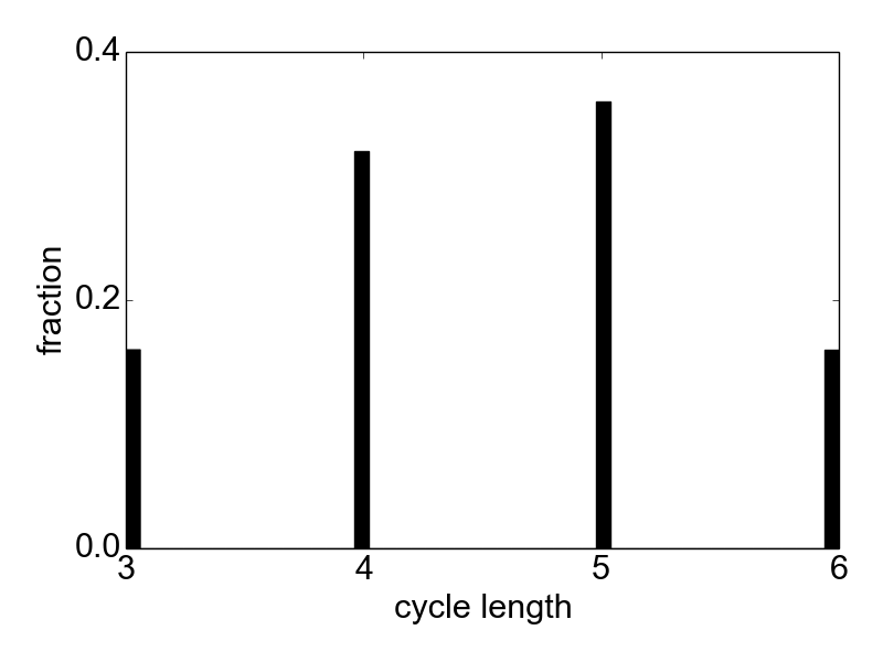
Figure 6. Distribution of cycle lengths.
fig, ax = plt.subplots()
plt.hist(scores, weights=[1. / n_cycles] * n_cycles, bins=50, color='k')
plt.xlabel('cycle score')
plt.ylabel('fraction')
plt.locator_params(nbins=3)
plt.tight_layout()
plt.savefig('cycle_scores.png')
plt.close()
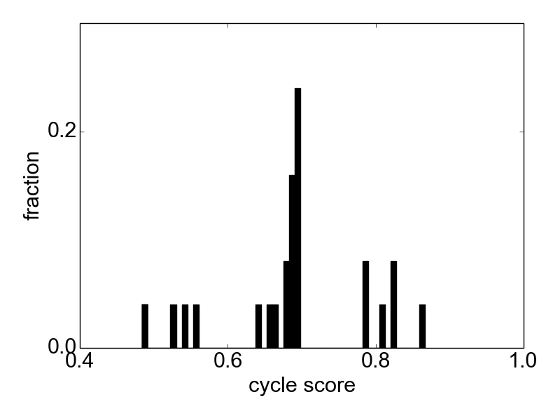
Figure 7. Distribution of cycle scores.
fig, ax = plt.subplots()
plt.scatter(cycle_len, scores, color='k')
plt.xlabel('cycle length')
plt.ylabel('cycle score')
plt.locator_params(nbins=3)
plt.tight_layout()
plt.savefig('cycle_lengths_vs_scores_scatter.png')
plt.close()
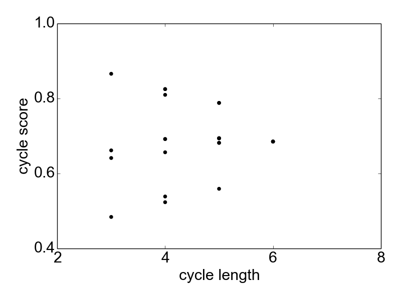
Figure 8. Scatter plot of cycle lengths vs cycle scores.
Let us now combine the memories of the cycles and plot the mean network response for each cycle:
for i, cycle in enumerate(cycles):
    mta_sequence = [patterns.pattern_to_mta_matrix(l).reshape(10, 1)
                    for l in cycle]
    combined = combine_windows(np.array(mta_sequence))
    fig, ax = plt.subplots()
    plt.matshow(combined, cmap='gray', vmin=0, vmax=1)
    plt.axis('off')
    plt.title('cycle %d\nlength %d\nscore %f' % \
              (i, len(cycle), scores[i]), loc='left')
    plt.savefig('likely-%04d.png' % i)
    plt.close()
As we can see, these responses exactly correspond to the sequence of cell assembly activations planted in the data. The method was thus able to extract these recurring sequences in noisy data.